
Tiny Giant
Client
Tiny Giant
Services
Brand Identity, Art Direction
Industry
Creative Agency
Year
2024
The Brief
A new creative agency brand, built from nothing.
Tiny Giant approached us to build a complete brand identity for the launch of a new creative agency. The brief was to avoid every visual cliché of the "agency" category—no generic corporate templates, no interchangeable service-card layouts—and instead create something confident, editorial, and a little unexpected.
Reference points given were studios like Baby Teeth and OK Cool: minimal, assured, attitude over explanation. Rather than locking the agency to a single industry niche, the brand needed to read as premium and flexible enough to serve any ambitious business with the budget to back it.
The Approach
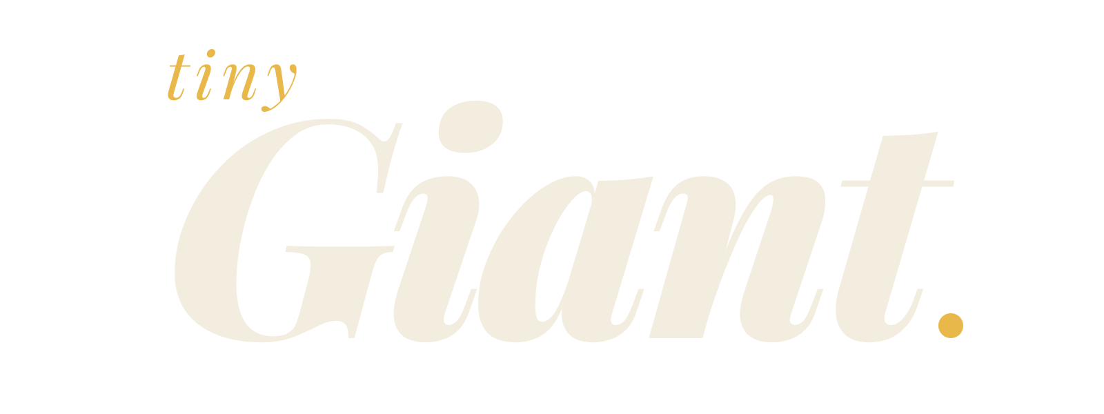
The identity centres on a stacked wordmark—"tiny" in small italic type sitting above "Giant." in large, bold italic, with the full stop picked out in gold.
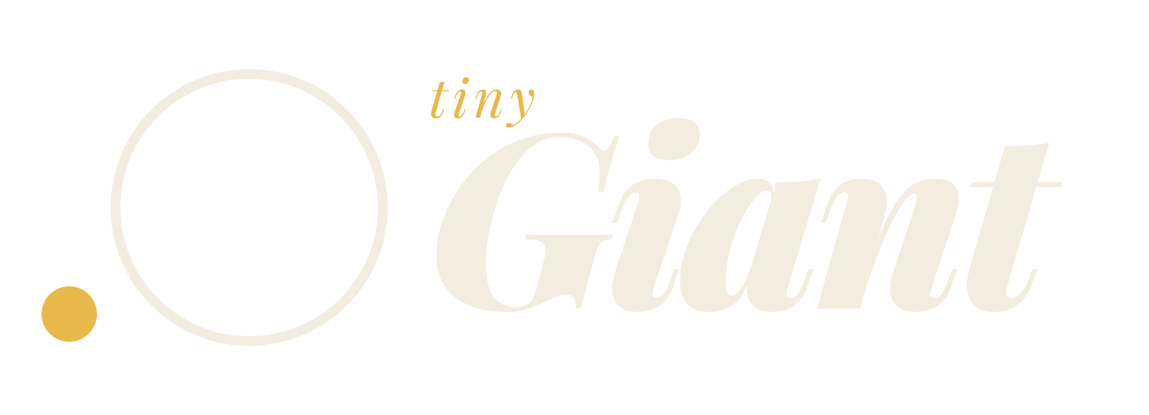
Alongside it, an abstract mark: a large outlined circle with a single solid gold dot orbiting at its base—a quiet nod to the "tiny/giant" contrast at the heart of the name.
Brand System
Colour Palette
Ink
#0F0F0D
Carbon
#1A1A17
Char
#2E2E2A
Parchment
#F2EDDF
Saffron
#E8B84B
Typography
Display / Playfair Display Italic
Confident, editorial, unexpected.
Body / DM Sans Light
A clean, highly legible sans-serif that provides a modern counterpoint to the expressive display type, ensuring functional readability across all digital touchpoints.


Outcome
The finished identity now carries the brand across its website, social presence (@itstinygiants), and newsletter (@giantthought)—a confident, distinctive look built to stand apart from a category full of sameness.